
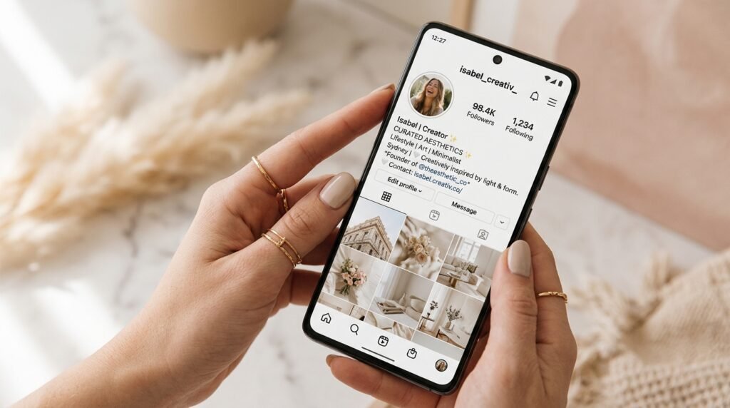
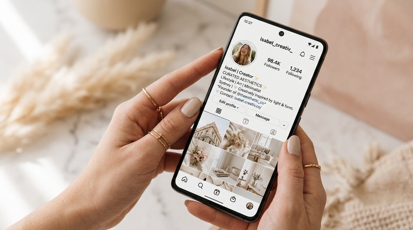
Discover the most popular unicode fonts that top influencers are using to make their profiles stand out on Instagram in 2026.
Your Instagram bio is your digital business card. In a world where thousands of accounts compete for the same followers, your bio has a single job: make a memorable first impression within the first two seconds. The fonts you choose — whether bold, italic, cursive, or minimalist — say more about your brand than most people realize. This guide reveals the 10 most effective aesthetic Unicode font styles that top content creators are using right now in 2026.
Best of all, these are not actual font files you need to install. They are standard Unicode characters, meaning they work on every device, every browser, and every version of the Instagram app without any plugins or hacks.
Why Instagram Bio Fonts Matter
Instagram's own font is clean but generic. When every account uses the same typeface, it becomes much harder to stand out in a crowded feed. A well-styled, readable bio signals creativity, effort, and professionalism — qualities that consistently attract followers and encourage profile visits. This is exactly why top creators invest time in choosing the right font style for their profile.
The Top 10 Instagram Bio Font Styles
1. Bold Serif (Mathematical Bold)
This style uses Unicode mathematical bold characters that render as thick, heavy serif letters. It commands attention immediately and works beautifully for names and titles in bios.
2. Cursive Script (Mathematical Script)
The cursive script font is the most popular choice for fashion, beauty, and lifestyle influencers. It gives a luxurious, handwritten feel that immediately evokes elegance and femininity. It works especially well for brand names, niches, and personal taglines.
3. Aesthetic Fullwidth
Full-width (Aesthetic) text creates that distinctive vaporwave, e-girl, and VSCO aesthetic that became a cultural phenomenon. These wide, spaced-out characters are immediately recognizable and deeply tied to internet culture. Perfect for niche accounts in art, music, or alternative fashion.
4. Double-Struck (Outlined)
Double-struck letters have a hollow, outlined look that comes from mathematical blackboard notation. They look modern, tech-forward, and clean. Ideal for tech, gaming, or finance-related accounts.
5. Small Caps
Small capitals give a classic, magazine-editorial feel. They are used extensively by premium lifestyle brands and personal finance influencers who want to communicate authority and trustworthiness without being aggressive.
6. Gothic / Blackletter
The Gothic or Blackletter style draws from medieval manuscripts and modern streetwear culture simultaneously. It is extremely popular in tattoo art, hip-hop, and underground music communities.
7. Italic Bold (Mathematical Italic Bold)
A sleek combination of bold weight and italic lean, this style is energetic and dynamic. It works incredibly well for sports influencers, fitness coaches, and motivational accounts.
8. Bubble Letters
Bubble letters are round, friendly, and inherently playful. They are a staple for children content creators, food bloggers, and accounts targeting younger demographics who want a fun, approachable image.
9. Strikethrough (Redacted)
A creative and ironic use of the strikethrough Unicode combines standard text with a ̶c̶r̶o̶s̶s̶e̶d̶-̶o̶u̶t̶ appearance. Meme accounts, satirical pages, and edgy creators use this to add humor and personality to their bios.
10. Zalgo / Glitch Text
Zalgo text stacks combining diacritical marks on top of and below letters to create a chaotic, glitched appearance. It is extreme but highly attention-grabbing for horror, gaming, and cyberpunk aesthetics.
How to Use These Fonts in Your Instagram Bio
- Go to FonteLy and type your bio text into the generator.
- Browse through the font styles and click on one you like to copy it.
- Open the Instagram app on your phone.
- Go to Edit Profile → Bio.
- Long-press in the bio field and tap Paste.
- Save your changes and preview how your new bio looks to visitors.
Tips for Maximum Impact
The Science Behind First Impressions on Instagram
Psychological studies indicate that internet users form an opinion about a website or social media profile within 0.05 seconds. On Instagram, this 'blink' judgment is entirely visual. When a potential follower lands on your page, their eyes scan your profile picture, grid aesthetic, and immediately land on your bio text. If your bio uses the standard Instagram system font, it blends into the background of thousands of other profiles they have seen that day. By introducing a visual disruptor—such as a cursive or bold Unicode font—you force the brain to slow down its scanning process.
This cognitive pause is exactly what you need to convert a visitor into a follower. It gives them an extra second to read your value proposition, your achievements, or your call-to-action. In the highly competitive attention economy of 2026, those micro-seconds are the difference between a bounce and a new loyal fan.
How to Match Your Bio Font to Your Brand Identity
Not all fonts convey the same message. Selecting a typography style that contradicts your brand's core identity can confuse your audience. It is crucial to align the visual weight and style of the Unicode characters with the emotional response you want to elicit.
| Brand Archetype | Recommended Font Style | Emotional Impact |
|---|---|---|
| The Creator / Artist | Cursive & Aesthetic Fullwidth | Elegant, Dreamy, Expressive |
| The Expert / Coach | Bold Serif & Small Caps | Authoritative, Trustworthy, Professional |
| The Gamer / Tech | Glitch, Monospace, Double-Struck | Modern, Edgy, Digital |
| The Entertainer / Meme | Bubble Letters, Strikethrough | Playful, Ironic, Approachable |
For example, a luxury real estate agent using bubble letters in their bio might severely undermine their professional credibility. Conversely, a streetwear brand using standard system fonts misses a massive opportunity to showcase their edgy, counter-culture identity through Gothic or Glitch text.
Common Mistakes to Avoid When Styling Your Instagram Profile
While custom fonts are powerful tools for growth, they must be used strategically. Many creators discover Unicode text generators and immediately over-optimize their bios, resulting in an unreadable mess. Here are the top three mistakes to avoid:
✦ Try Fontely Font Generator
Convert any normal text into 140+ aesthetic, cute, and fancy Unicode fonts instantly with one click.
Frequently Asked Questions
Will these fonts work on all Instagram versions?
Yes. Since these are standard Unicode characters and not actual fonts, they work on every version of Instagram on both iOS and Android. They will also display correctly to anyone who views your profile, regardless of what device or OS they use.
Do these fonts affect my Instagram engagement?
Indirectly, yes. A well-styled, readable bio increases the time visitors spend on your profile page, which signals to the algorithm that your profile is worth exploring. It also increases the likelihood that first-time visitors will click the Follow button.
Are there any fonts I should avoid on Instagram?
Avoid Zalgo text in professional bios as it can be difficult to read and may look unprofessional. Also avoid very similar-looking fonts to what Instagram already provides, as they won't make much of an impact. The goal is to stand out, not to blend in.
