

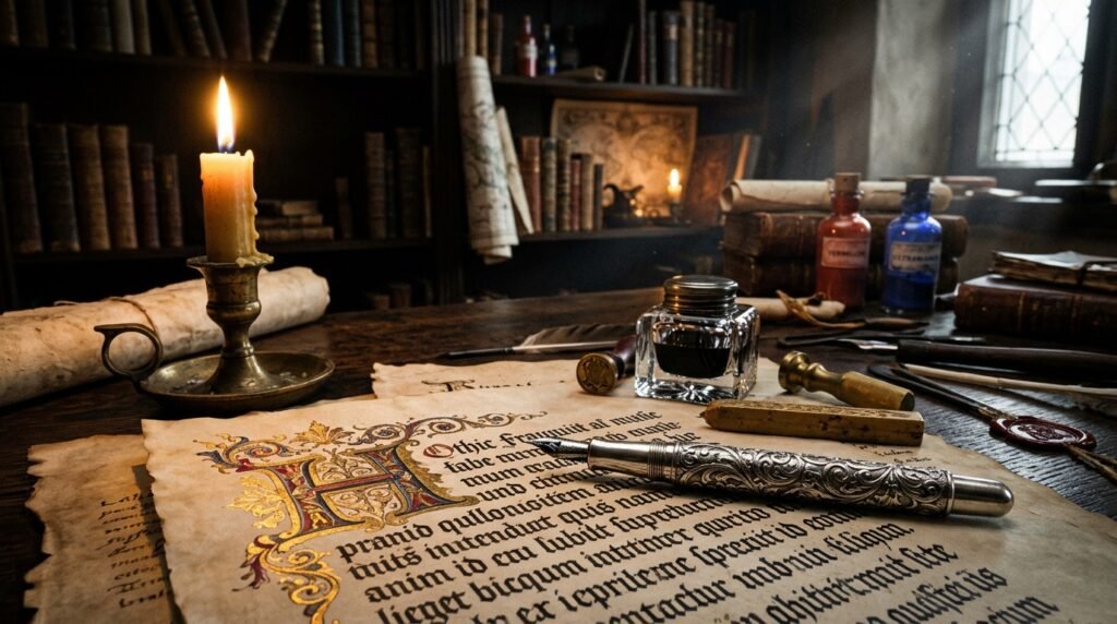
Few typographic families in human history carry the architectural weight, dramatic majesty, and cultural aura of Gothic Blackletter and Fraktur. Originating in medieval Western Europe and perfected during the dawn of the printing press by Johannes Gutenberg, blackletter typography has survived over eight centuries of political revolution, technological upheavals, and aesthetic reinterpretations. Today, in 2026, Gothic Fraktur is experiencing an explosive modern renaissance—dominating luxury streetwear brands like Chrome Hearts and Palm Angels, defining dark academia Instagram profiles, anchoring heavy metal and hip-hop album cover typography, and adorning contemporary chicano tattoo culture. In this authoritative 2,200+ word master guide, we explore the deep history, Unicode architecture, modern cultural resonance, and copy-paste mechanics of Gothic and Fraktur typography.
📜 Quick Summary: What You Will Discover in This 2,200+ Word Guide
- The eight-century historical evolution of Blackletter from 12th-century Textura to 16th-century German Fraktur.
- How modern computers render Gothic lettering across social media using mathematical Unicode glyphs without installing custom font files.
- A complete character-by-character comparison table comparing standard Latin, Regular Fraktur (𝔄-), and Bold Fraktur (𝕬-𝖅).
- Over 40+ ready-to-copy Gothic quotes, dark academia bio templates, and streetwear captions.
- Vital digital accessibility and SEO guidelines: how screen readers interpret mathematical alphanumeric blocks.
- A comprehensive FAQ answering common compatibility and historical queries.
Table of Contents
- The Eight-Century Lineage: From Gutenberg to the Digital Age
- The Four Pillars of Blackletter: Textura, Rotunda, Schwabacher & Fraktur
- The Digital Engineering of Copy-Paste Gothic Fonts in Unicode
- The Cultural Renaissance: Streetwear, Hip-Hop & Dark Academia
- Complete A-Z Gothic & Fraktur Character Matrix
- 1. Luxury Streetwear & Bold Fraktur Quotes
- 2. Dark Academia & Philosophical Latin Bios
- 3. Mystical Occult & Victorian Melancholy Bios
- 4. Minimalist One-Word Gothic Display Handles
- Digital Accessibility & Screen Reader Pitfalls
- How to Generate Gothic & Fraktur Fonts Instantly with Fontely
- Frequently Asked Questions (FAQ)
The Eight-Century Lineage: From Gutenberg to the Digital Age
The origin of blackletter scripts dates back to mid-12th-century Western Europe. Prior to this period, scribes across the Carolingian Empire copied manuscripts using Carolingian minuscule—a round, wide, easily readable script. However, as the founding of European universities created an unprecedented demand for books, parchment became scarce and expensive. Scribes needed a script that was narrower, more compressed, and capable of fitting significantly more words onto a single animal-hide folio.
The result was Blackletter (also referred to historically as Gothic script or Textura). Characterized by rigid vertical strokes, sharp angles, dense ligatures, and minimal whitespace, pages written in blackletter appeared as a dense, dark woven fabric—giving rise to the Latin name textura quadrata (“woven texture”).
When Johannes Gutenberg introduced the movable type printing press in Mainz around 1455, he did not invent a new typeface. To convince a conservative public and ecclesiastical hierarchy that mechanically produced Bibles were equal in spiritual dignity to hand-copied works, Gutenberg meticulously cast over 290 individual blackletter type sorts replicating the liturgical script of German scribes. His celebrated 42-Line Bible stands today as the supreme masterpiece of blackletter typography.
The Four Pillars of Blackletter: Textura, Rotunda, Schwabacher & Fraktur
Typographers classify historic blackletter into four dominant regional and chronological traditions:
- Textura (12th–15th Century): The most rigid, architectural form of blackletter. Featuring steep vertical stems and triangular serifs that mirror Gothic cathedral arches, Textura was reserved strictly for liturgical texts, royal decrees, and church Bibles.
- Rotunda (Southern European Gothic): Developed primarily in Italy, Spain, and southern France. Rotunda rounded the harsh northern angles of Textura, incorporating wide curved bowls inspired by classical Roman lettering to maximize reading speed in warm Mediterranean sunlight.
- Schwabacher (15th–16th Century): A vibrant, vernacular German script with round, bulbous lowercase letters (notably the rounded ‘o’ and looped ‘g’). Schwabacher became the typography of the Protestant Reformation, utilized by Martin Luther to print his vernacular German translation of the New Testament.
- Fraktur (16th–20th Century): Commissioned around 1513 by Holy Roman Emperor Maximilian I and perfected by master calligrapher Leonhard Wagner and typographer Hieronymus Andreae. The name Fraktur derives from the Latin fractura (“broken line”), referencing the sharp, fractured fractures where straight and curved strokes intersect. Fraktur remained Germany’s official national typeface for over 400 years until 1941.
The Digital Engineering of Copy-Paste Gothic Fonts in Unicode
When you copy a Gothic phrase from Fontely and paste it into an Instagram bio, Twitter post, or Discord username, you are not applying a CSS font-family or uploading a .ttf file. Instead, you are leveraging a standardized digital encoding system known as Unicode.
In standard ASCII, the uppercase Latin letter “A” is assigned the hexadecimal code point U+0041. When the Unicode Consortium standardized mathematical notation for scientific publishing, academic mathematicians required distinct symbols to distinguish ordinary algebraic variables from vectors, Lie algebras, and ideals. Consequently, the Unicode Consortium allocated specialized blocks for Mathematical Alphanumeric Symbols:
- Mathematical Fraktur (Regular): Resides in the code range
U+1D504throughU+1D537(e.g., 𝔄, 𝔅, ℭ, 𝔇, 𝔈…). Note that historical letters like ℭ (U+212D), ℌ (U+210C), ℑ (U+2111), ℜ (U+211C), and ℨ (U+2128) had already been assigned to the Letterlike Symbols block. - Mathematical Bold Fraktur: Resides in the code range
U+1D56CthroughU+1D59F(e.g., 𝕬, 𝕭, 𝕮, 𝕯, 𝕰…).
Because every modern operating system (iOS, Android, Windows, macOS, Linux) includes native fallback fonts for the Mathematical Alphanumeric block, these characters display effortlessly across all social media apps without requiring users to download special keyboards.
The Cultural Renaissance: Streetwear, Hip-Hop & Dark Academia
In the 21st century, blackletter has broken free from its historical ecclesiastical boundaries to become one of the most potent aesthetic symbols in global popular culture:
- Luxury High-End Streetwear: Pioneered by luxury jewelry house Chrome Hearts and popularized globally by designers like Jerry Lorenzo (Fear of God) and Francesco Ragazzi (Palm Angels), Old English Gothic lettering evokes aristocratic rebelliousness, exclusivity, and raw craftsmanship.
- Modern Hip-Hop & Rock Crossovers: Artists such as Kanye West (The Life of Pablo merchandise designed by Cali Thornhill DeWitt), Travis Scott, Playboi Carti, and Lil Uzi Vert utilized heavy Fraktur scripts to merge heavy metal darkness with hip-hop swagger.
- Dark Academia Aesthetics: On TikTok and Instagram, the Dark Academia subculture embraces gothic architecture, Oxford libraries, tweed wool coats, and classical literature. Regular Fraktur provides the ideal scholarly, antique accent for book reviews and bio headers.
Complete A-Z Gothic & Fraktur Character Matrix
The table below illustrates the side-by-side typographic comparison of standard Latin letters alongside their Unicode Regular Fraktur and Bold Fraktur counterparts:
1. Luxury Streetwear & Bold Fraktur Quotes
These heavy, commanding bold phrases are ideal for fashion brand Instagram bios, clothing line lookbook captions, and streetwear moodboards.
Luxury streetwear aesthetic • Heavy silver cross styling
Sovereign posture • Unbreakable resilience
Monarchic gothic declaration
Relentless dark streetwear banner
2. Dark Academia & Philosophical Latin Bios
For writers, philosophy majors, literature scholars, and creators whose feeds are filled with vintage fountain pens, classical architecture, and wax-sealed letters.
Remember death • Love your fate • Stoic Latin philosophy
Through hardships to the stars • Classical Latin motif
To dare is to do • Light in darkness
3. Mystical Occult & Victorian Melancholy Bios
Drawing from Victorian spiritualism, tarot arcana, and gothic romance literature (Bram Stoker, Mary Shelley, Edgar Allan Poe).
Victorian midnight poetry • Gothic literature enthusiast
Romanticizing ruins, gargoyles and cathedral bells
4. Minimalist One-Word Gothic Display Handles
If you want a striking visual accent for your Instagram display name or TikTok username, a single uppercase word rendered in bold Fraktur commands immense presence:
Digital Accessibility & Screen Reader Pitfalls
While Gothic typography creates immense aesthetic allure, web designers and creators must understand how screen readers handle Mathematical Alphanumeric characters.
Assistive screen reader software (such as Apple VoiceOver, JAWS, or NVDA) is engineered to interpret Unicode literally. When a screen reader encounters standard Latin text reading LOVE, it synthesizes the English word “Love”. However, when it encounters the bold Fraktur equivalent 𝕷𝕺𝖁𝕰, it reads each character’s technical Unicode name aloud:
“Mathematical Bold Fraktur Capital L, Mathematical Bold Fraktur Capital O, Mathematical Bold Fraktur Capital V, Mathematical Bold Fraktur Capital E.”
For this reason, digital accessibility guidelines strongly recommend:
- Never render essential accessibility information in Fraktur: Keep business contact emails, price tags, emergency notices, and legal disclaimers in standard plain Latin characters.
- Limit Fraktur to decorative titles and short quotes: Using Fraktur for one or two headline words adds tremendous visual value without frustrating visually impaired followers.
- Preserve Plain SEO Keywords: Instagram and Google search algorithms struggle to match Mathematical Fraktur with standard keyboard queries. Always keep your primary searchable brand name in plain text.
How to Generate Gothic & Fraktur Fonts Instantly with Fontely
Generating customized Gothic words or phrases requires no manual Unicode lookup tables. With Fontely’s Gothic Font Generator, transformation happens instantaneously in your browser:
- Visit the Fontely homepage.
- Type your brand name, quote, or slogan into the interactive text box.
- Scroll down to inspect both Fraktur (𝔊𝔬𝔱𝔥𝔦𝔠) and Bold Fraktur (𝕲𝖔𝖙𝖍𝖎𝖈) preview cards.
- Click the green Copy button to immediately save the characters to your clipboard.
- Paste seamlessly into Instagram, TikTok, Discord, Photoshop, or Canva.
Frequently Asked Questions (FAQ)
What is the difference between Old English and Fraktur?
While both belong to the broad Blackletter family, “Old English” typically refers to English Textura quadrata—the ornate, heavily decorated style used in medieval England and later adopted by mastheads like The New York Times. Fraktur, by contrast, is a specific 16th-century German evolution characterized by broken curved lines and distinct lowercase ascenders. In modern internet culture, the terms are frequently used interchangeably.
Will Gothic Unicode letters work in Instagram bios on older phones?
Yes. The Mathematical Alphanumeric Symbols block was standardized in Unicode 3.1 back in March 2001. Any smartphone manufactured in the past decade (running iOS 9+ or Android 6+) possesses complete font glyph support for both Regular and Bold Fraktur.
Can I use Gothic copy-paste text in graphic design software like Photoshop?
Yes, you can paste Unicode Fraktur characters directly into text layers in Adobe Photoshop, Illustrator, Premiere Pro, Figma, and Canva. However, professional graphic designers often prefer installing dedicated OpenType font files (such as Cloister Black or Fette Fraktur) for complete control over kerning, tracking, and stylistic alternate ligatures.
